

Overview ꄗ
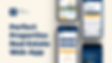
Perfect Properties on InVision is a responsive web app designed for new property buyers seeking financial security. In a real estate landscape filled with complexity, this user-friendly tool caters to individuals like Rashida, an IT consultant, by offering easy property searches, detailed information, and efficient decision-making. With a focus on clean and smart design, the app's goal is to streamline the process for users, helping them save time and make informed choices. From user flow diagrams to high-fidelity mobile UI mockups, the project encompasses various design elements to create a seamless and visually appealing experience for users like Rashida. The development process is a part of the CAREERFOUNDRY course.
Duration
2-month time span of the CAREERFOUNDRY course

Sole UI lead - I independently managed this project, consistently engaging in reviews with my tutor, mentor, and fellow designer
Team
Wireframes, Mood board, Style Guide, Mobile Mockups, UI mockups at different breakpoints, UI Prototype, Animation
Role
Figma, AdobeXD, Adobe Photoshop, Adobe Illustrator, InVision, Marvel, Google Docs, Canva
Tools
Problem Statement
The user is a busy, independent professional who needs a way to quickly and efficiently identify suitable properties for investment, due to the demands of her hectic professional life.
We will know this to be true when we see when users search for property and are provided with comprehensive information, and enable swift decision-making to fulfill their goal of achieving financial security.
Design
Process
01 Discover
-
User Persona
02 Define
-
User Stories
-
User Flows
03 Develop
-
Low-Fidelity
-
Mid-Fidelity
-
Moodboard & Color Palette
04 Deliver
-
High-Fidelity
-
Style Guide
-
Mockups
01 Discover
User Personas

I want to provide my family with
financial security. I’ve been considering
buying property for a while, and am
looking for a tool that can help me find
what I’m looking for, quickly
User Flows
02 Define
As a user, I want access to as much written and visual information as possible about properties I’m interested in so that I can make an informed decision.
View Listings
As a user, I want to be able to search and filter properties, so that I can find good matches based on my needs.
Sort Filter
As a user, I want to be able to contact the right people if I am interested in viewing a property so that I schedule a viewing.
Contact Agent
User Flow - View Listings

User Flow - Sort Filter

User Flow - Contact Agent


03 Develop
03 Develop


Moodboard

The creation of the mood board resonates with Rashida's needs, prioritizing trust and reliability in her property search. The blue hues convey confidence, the yellow accents signify insight, and the greyscale tone maintains a minimal clean aesthetic, while the touch of green adds a sense of security. This mood board was meticulously formulated and integrated into the UI design to align with Rashida's lifestyle and preferences.
In UI design, it holds significance as it:
Establishes a cohesive visual language for the overall design.
Ensures consistency in design elements, color schemes, and aesthetics.
Enhances usability by incorporating Rashida's preferences.
Contributes to a user-friendly experience and meets functional requirements.
Finalized Color Palette

I formulated this color palette for specific reasons in the UI design of the web app:
Brand Identity Emphasis: The color choices intentionally emphasize the brand identity, creating a recognizable and consistent visual representation.
High-Contrast Composition: With a Midnight Blue background, white text, and yellow-orange buttons, enhances visibility and readability, contributing to a better user experience.
Visually Striking Interface: Conveying transparency and confidence through color choices that resonate with the mood board inspiration.
60/30/10 Rules: Adherence to the 60/30/10 rules ensures a balanced and visually appealing layout, enhancing the overall design aesthetics.
In the context of UI design for this web app, these considerations play a crucial role in creating a cohesive, user-friendly, and brand-consistent visual experience.
I formulated this color palette with the bold Midnight Blue as the primary color for specific reasons in the UI design of the web app:
- Brand Identity Emphasis: The color choices intentionally emphasize the brand identity, creating a recognizable and consistent visual representation.
-
High-Contrast Composition: With a Midnight Blue background, white text, and yellow-orange buttons, enhances visibility and readability, contributing to a better user experience.
-
Visually Striking Interface: Conveying transparency and confidence through color choices that resonate with the mood board's inspiration.
-
Rule of 60/30/10 Rules: Adherence to the 60/30/10 rules ensures a balanced and visually appealing layout, enhancing the overall design aesthetics.
In the context of UI design for this web app, these
considerations play a crucial role in creating a cohesive, user-friendly, and brand-consistent visual experience.
04 Deliver


Style Guide


Mockups
Different Breakpoints

MOBILE GRIDS - HOMEPAGE
Size: 430x932px
Columns: 4 Frames
Type: Stretch
Width: Auto
Gutter width: 20px
Margin: 24px

TABLET GRIDS - HOMEPAGE
Size: 834x1194px
Columns: 8 Frames
Type: Stretch
Width: Auto
Gutter width: 20px
Margin: 32px

DESKTOP GRIDS - HOMEPAGE
Size: 1440x1024px
Columns: 12 Frames
Type: Stretch
Width: Auto
Gutter width: 20px
Margin: 40px

MOBILE GRIDS - PROPETY DETAILS PAGE
Size: 430x932px
Columns: 4 Frames
Type: Stretch
Width: Auto
Gutter width: 20px
Margin: 24px

TABLET GRIDS - PROPETY DETAILS PAGE
Size: 834x1194px
Columns: 8 Frames
Type: Stretch
Width: Auto
Gutter width: 20px
Margin: 32px
MOBILE GRIDS - PROPERTY DETAILS PAGE
Size: 430x932px
Columns: 4 Frames
Type: Stretch
Width: Auto
Gutter width: 20px
Margin: 24px

DESKTOP GRIDS - PROPETY DETAILS PAGE
Size: 1440x1024px
Columns: 12 Frames
Type: Stretch
Width: Auto
Gutter width: 20px
Margin: 40px
Different breakpoints in responsive design are essential for adapting UI to diverse screen sizes, ensuring a seamless and user-friendly experience.


Interactive Prototype ꄗ


Start with clicking on bugermenu!
-
Analyze user feedback and performance data to pinpoint specific areas of the UI that may need improvement, with a focus on responsiveness and usability on tablets and desktops.
-
Prioritize enhancements for breakpoints where users encounter challenges or experience suboptimal interactions.
-
Implement a user-centric approach by prioritizing user testing to understand user preferences, pain points, and behaviors across different breakpoints.
Areas of Improvement
-
Prioritize user testing for tablet and desktop views to ensure the UI design adapts effectively across various breakpoints.
-
Gather feedback on the user experience, particularly exploring how users interact with the web app on larger screens.
-
Create more user personas in testing scenarios to ensure the application reflects a diverse range of users with different needs and wants.
-
Introduce an A/B test to refine the design to its best satisfaction.
User Testing
-
Implement changes and updates to the responsive design based on identified areas of improvement, ensuring a seamless experience across all breakpoints.
-
Conduct thorough validation through additional user testing and gather feedback to validate the effectiveness of the design adjustments, especially for tablet and desktop views.
-
Iterate on the design based on validation results to achieve an optimal and user-friendly UI across different breakpoints.
Validation Methods
-
Explore hypotheses related to the efficiency and effectiveness of the property search feature on larger screens.
-
Investigate hypotheses regarding user engagement and interaction patterns across various breakpoints.
-
Formulate hypotheses on how visual elements and content presentation can be optimized for enhanced user comprehension on tablets and desktops.

